top of page
Фірмовий стиль фестивалю OBRIY
Gulliver’s Travels to Lilliput – Illustrated Book Design.

The book is in Ukrainian and designed with a strong emphasis on its satirical themes. My goal was to visually interpret the absurdity, pettiness, and cruelty depicted in Swift's social satire — themes that remain relevant today.

I approached this as both a book illustrator and graphic designer, handling every stage from text layout to visual storytelling and print design.


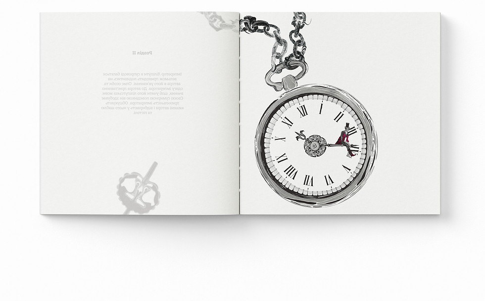
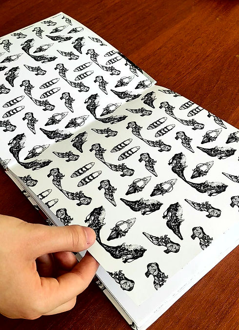
All illustrations were hand-drawn digitally using a graphic tablet. The visual language is detailed and primarily monochromatic, with selective use of a deep burgundy accent. This restrained color palette was chosen to highlight emotional depth and narrative tension.


Each new chapter begins with custom-drawn display lettering that reflects the mood and theme of the section — blending illustration and typography to strengthen narrative identity.
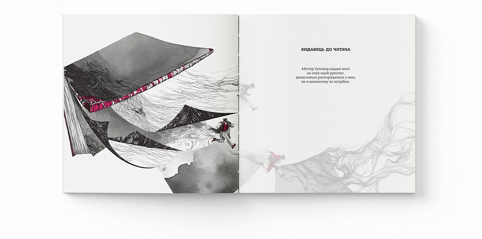


Chapter title pages are printed on translucent tracing paper, with the title text floating above a full-page illustration. This layered approach creates a physical metaphor for interpretation — revealing the content through both material and image.


The internal structure was carefully developed to balance narrative flow and visual impact. I designed a flexible editorial grid system that supports both text and imagery without compromising readability.


This project bridges editorial design, book arts, and narrative illustration, drawing attention to the power of visual media in reinterpreting literary classics. Every design decision — from format to material — was made to support the book’s conceptual depth and the reader’s sensory engagement.
bottom of page